
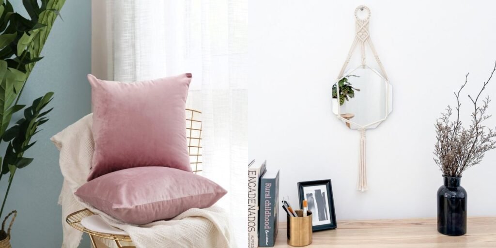
Something has genuinely shifted in how people want their homes to feel. After nearly a decade of glossy, staged-for-Instagram minimalism, all-white kitchens, razor-edged sofas, and rooms that photographed beautifully but never quite felt lived in, homeowners are pulling back toward warmth, weight, and texture you can actually feel under your hand. This is not a passing mood swing. Pantone’s own 2026 Color of the Year, Cloud Dancer, was chosen specifically as a reset against visual noise, and its brief explicitly pairs that soft white with natural wood and stone rather than cold, hard surfaces. At the same time, paint makers who usually chase the opposite instinct- Sherwin-Williams with Universal Khaki, Glidden with Warm Mahogany, and Graham & Brown with the deep, fig-toned Divine Damson– are all leaning into earthy, grounded color for the year ahead. When the whole industry, from the whitest whites to the deepest browns, converges on warm and textural, that is not a trend. That is a correction.
This piece looks at how that correction is playing out room by room, using the decorating philosophy published by MintPalDecor as the throughline, a platform built around one idea: good design should make a house easier to live in, not just easier to photograph. What follows is not a shopping list. It is a working framework for deciding which shifts are worth your time, your budget, and your walls.
What Is MintPalDecor?
MintPalDecor is a digital resource built around home decoration, spatial styling, and practical architectural improvement, advice that assumes you own the house you are decorating, not that you are staging it for a magazine spread. Its editorial approach is noticeably restrained compared to most design media. Rather than chasing every micro-trend, the guides circle back to a handful of durable principles: balanced proportion, honest material choices, and lighting layered the way a good hotel lobby layers it, rather than blasted from a single ceiling fixture.
The content spans color theory as it applies to real rooms, material selection for surfaces that need to survive daily use, furniture layouts built around how people move through a space, and multi-tiered lighting design. What separates it from most design content is the refusal to treat every trend as universally applicable. The standard is that a choice only earns its place if it solves a specific problem: a dim corner, a flat wall, or a room that feels unfinished despite having enough furniture in it. That is the filter this article applies throughout.
What Does “Latest Decoration Trends MintPalDecor” Mean?
This search phrase is shorthand for a question a lot of homeowners are quietly asking: which current interior design ideas are actually worth adopting, and which are just noise? A brand-plus-topic search like this one usually signals someone who has already scrolled past a hundred generic top trends listicles and wants something grounded, guidance tied to real budgets and real square footage, not aspirational renovation photography.
Chasing a decorating trend should never mean gutting a functioning room or replacing furniture that is doing its job. A trend earns its place only if it solves something: better light distribution in a dim room, tactile interest on a flat wall, a clearer focal point in an awkward layout, or improved day-to-day usability. Everything here is filtered through that test. If a trend does not solve a real problem in your space, skip it, no matter how often it shows up in your feed.
Where Home Decoration Is Heading in 2026
The clearest signal of where residential design is heading does not come from a single influencer or showroom, it comes from search data. Houzz’s most recent trends report shows searches for chocolate brown climbing 153% and rust colors up 178%, while mushroom and other soft, warm neutrals rise in parallel. That is not a contradiction. It is the same instinct expressing itself at two ends of the palette: people want color with weight and warmth. The same report found biophilic design searches up 112% and calming as a design keyword up 139%, which tracks with what working designers have been saying for two years now: homes are being asked to function as recovery spaces, not just backdrops.
Four movements are driving this shift broadly. Warmth is replacing starkness, with cream, beige, and earthy undertones taking over from the cool gray-and-white palettes that dominated the last decade. Tactile richness, unrefined timber, rough plaster, slubbed linen, woven fiber, is becoming a baseline expectation rather than a luxury upgrade. Custom millwork is returning through paneling, moldings, and curved details that give flat drywall a sense of history. And contemporary furniture is increasingly paired with genuinely old pieces, creating rooms that read as collected over years rather than purchased in a single trip.
None of these movements exist in isolation. They share one thread: longevity over novelty, and materials that age well over materials that just look good on delivery day.
Warm Neutrals Are Replacing Stark Minimalism
The clinical, cool-white interior has largely run its course. What is replacing it is a broader, more forgiving spectrum: cream, taupe, sand, camel, and warm greige, built to sit comfortably alongside natural wood tones instead of fighting them. This is not just an aesthetic preference; it is a lighting one. Warm neutrals reflect ambient light gently, without producing the harsh, flat shadows a stark white wall throws once the sun moves past midday.
The trap most homeowners fall into with warm neutrals is monotony. When walls, flooring, and the largest upholstered pieces sit in the same tonal family, a room can go flat fast, not because the color is wrong, but because there is nothing for the eye to catch on. The fix is texture and sheen variation within that same neutral family:
- Matte plaster or a chalk-finish paint against oiled oak flooring
- Bouclé or heavy linen upholstery set next to a dark walnut table
- A woven jute or wool rug anchoring smooth leather seating
- Brushed brass or aged bronze hardware against warm ivory cabinetry
Vary the finish, not just the color, and a muted palette feels considered rather than accidental. The neutral backdrop becomes exactly that, a backdrop, letting architectural detail, artwork, and daylight do the actual work of defining the room.
Natural Materials Bring Depth Without Adding Clutter
Solid hardwood, honed stone, linen, hand-thrown ceramic, and rattan do something synthetic surfaces structurally cannot: they carry natural variation. No two planks of oak grain identically, and no two pieces of honed travertine vein the same way. That inconsistency reads as settled and expensive, even in a modest room, and means you do not need to fill a space with objects to make it feel finished.
Hardwood does the heaviest lifting structurally. Dining tables, flooring, and open shelving benefit from its weight and grain. Natural stone like travertine, honed marble, or slate earns its keep on counters and hearths, surfaces that need to withstand daily contact. Unbleached linen softens hard window and bed frames while letting light filter through, and handmade ceramics bring irregular geometry to coffee tables and shelves in a way factory-perfect pieces never do.
The discipline here is density, not selection. A heavy stone tabletop paired with a slender oak frame and soft linen drapery stays balanced. Stack too many heavy materials in one room—thick-cut stone, chunky reclaimed wood, dense wool—and it starts to feel like a lodge rather than a living room.
Color Is Becoming More Confident
The all-neutral, all-the-time approach is losing ground to something more deliberate: deep forest green, terracotta, muted navy, burgundy, raw ochre, and warm charcoal. Paint makers are backing this with their own 2026 selections. Graham & Brown’s Divine Damson leans into a fig-and-mulberry tone, while Sherwin-Williams’ Universal Khaki and Glidden’s Warm Mahogany both push toward grounded, saturated earth tones rather than another pale gray. These colors bring architectural definition into a room. They can make an oversized space feel intimate and give a small room genuine identity instead of disappearing into beige.
None of this requires painting every wall a dark shade, and it should not, as that usually reads as a decision made under duress, not confidence. A more controlled approach lands better: upholstering one central sofa in deep burgundy or moss velvet, painting door frames and baseboards dark while walls stay neutral, hanging full-length curtains in muted slate or olive, or introducing one oversized abstract canvas with earth-toned pigments against plain plaster. Treated as a structural element rather than a background wash, color adds visual interest without swallowing the room’s natural light.
Accent Walls Need More Than a Can of Paint
An accent wall that is just a differently colored flat surface almost always reads as unfinished, because color alone does not create depth, it creates contrast. A wall that functions as a real focal point needs texture and dimension behind the color, not instead of it.
Several approaches build that dimension properly:
- Custom millwork such as vertical slatting, board-and-batten, or picture-rail molding gives a wall genuine three-dimensional shadow lines.
- Textured finishes like grasscloth wallpaper, hand-applied plaster, or lime-wash paint catch light differently throughout the day, which flat paint cannot do.
- Built-in storage paired with open timber shelving turns a wall into something functional as well as decorative.
- A curated gallery arrangement featuring large-format prints grouped deliberately and lit with directional accent lighting does more for a room than almost any single piece of furniture.
The wall you choose matters as much as what you put on it. A wall anchored by a fireplace mantel, a bed headboard, a dining buffet, or a natural alcove already has a reason to draw the eye. Painting a random blank wall simply because it has no furniture against it rarely works. You are fighting the room’s natural geometry instead of working with it.
Curved Furniture Is Softening Modern Rooms
The boxy sofa and sharp-edged coffee table had a long run, and they are not disappearing, but they are being balanced by rounded counterparts: curved sofa backs, pill-shaped dining tables, arched mirrors, circular side tables, and soft dome pendants. Houzz’s trends data backs this up directly, showing searches for arched range hood up 177% and rounded kitchen island climbing alongside it. This is happening in kitchens as much as living rooms. Curves interrupt long, rigid sightlines and, in tighter floor plans especially, genuinely improve how people move through a room. A rounded coffee table simply catches fewer knees than a square one.
Restraint matters here more than almost anywhere else on this list. One or two curved pieces against otherwise clean, rectangular lines, a straight sofa, a rectangular rug, reads as intentional. A room full of nothing but curves starts to feel like a showroom vignette rather than a lived-in space.
Mixing Vintage Pieces With Modern Furniture
A room built entirely from a single showroom collection almost always feels impersonal, no matter how well-made the pieces are, as there is no visible history in it. An aged wooden chest, a genuine mid-century side chair, or a weathered gilt mirror signals the room was built over time by someone with actual taste, not assembled from a catalog in an afternoon.
The craft of mixing eras is less about matching and more about finding a shared visual language:
- Scale and proportion matter first: low-slung modern seating sits naturally next to a low vintage table, but towers awkwardly over one too small.
- A shared material tone helps too: a contemporary black metal frame reads as intentional next to an antique dark walnut cabinet because the tones speak to each other even though the eras do not match.
- Repeating one accent color, pulling a rust thread from an old rug into new throw cushions, creates alignment without forcing a full match.
- Keeping surrounding walls simple lets the craftsmanship in older pieces stand out instead of competing with a busy backdrop.
When old and new share color, grain, or height, the room reads as curated across years. When they do not, it reads as mismatched, which is exactly why this detail is worth getting right before buying anything.
Texture Is Doing More Work in Neutral Rooms
In a room built on a quiet, low-contrast palette, texture carries the visual interest color would otherwise provide. Skip it, and a neutral room goes flat and cold fast, no matter how good the color choices are.
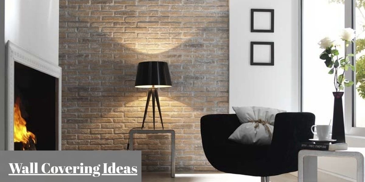
Coarse textiles, heavy wool knits, slubbed linen, bouclé, woven cotton throws, bring immediate softness to seating. Raw architectural surfaces, like lime-washed plaster, exposed brick, or hand-carved wood, add vertical depth flat drywall never will. Reflective accents, honed marble, matte-glazed ceramic, brushed metal, catch and bounce natural light through the day, keeping a monochrome room from looking static.
A rough linen sofa cover, a polished marble coffee table, a thick woven wool rug, and matte plaster walls together produce real contrast without a single bright color in the mix. The room stays calm because the palette is unified, but stays visually engaging because nothing in it shares the same surface quality as anything else.
Lighting Is Becoming Part of the Room’s Character
A single overhead ceiling fixture is functional, but it is also the fastest way to make a warm, textured room look flat and clinical. Top-down light throws hard shadows and washes out the grain, weave, and plaster texture you have just spent money adding. Contemporary interiors are moving decisively toward layered lighting, combining ambient, task, and accent sources at different heights instead of one ceiling grid doing everything.
A properly layered scheme works across three tiers:
- High-level illumination, sculptural pendants or dimmable recessed fixtures, sets overall brightness.
- Mid-level wall sconces highlight plaster texture, artwork, or an archway that would otherwise disappear after dark.
- Low-level task lighting, table lamps on consoles and reading tables, creates the small, warm pools of light that make a room feel occupied in the evening rather than just lit.
Bulb temperature matters more than most people realize: warm bulbs in the 2700K to 3000K range let wood grain, textiles, and paint tones read as intended after dusk, where a cooler bulb flattens all of that and makes even expensive materials look cheap. Dimmable controls let the same fixtures serve daytime tasks and evening ambiance without separate hardware for each.
Walls Are No Longer Just Background
Flat, undecorated drywall is increasingly the exception in current design thinking. Walls are treated as active surfaces with a job to do, not blank space to be filled around. Applied moldings like wainscoting, beadboard, or picture rails introduce geometric structure at very little cost relative to the payoff. Tactile finishes like lime-wash paint, micro-cement, or textured wallpaper create subtle movement under changing light that flat paint cannot replicate. Floating hardwood shelves add display storage without the bulk of a cabinet, and a large framed mirror hung opposite a window does double duty, bouncing daylight deeper into the room while acting as a design object in its own right.
Giving a wall a real design purpose does something structural to a room’s proportions: it balances the lower half of the space, pulls the eye upward, and makes standard ceilings feel taller than they actually are.
Sustainability Can Start With Buying Less
The most reliable form of sustainable decorating has little to do with eco-labels and almost everything to do with buying fewer, better things. Houzz’s most recent data shows searches for sustainable up 42% and repurposed materials nearly tripling, but the practical version of that instinct, for most homeowners, is not solar panels. It is choosing solid wood over particleboard, and choosing it once.
High-density timber furniture can be sanded, repaired, and refinished across decades, so it never actually needs replacing, only maintaining. Sourcing vintage or secondhand pieces reduces demand on new manufacturing while usually delivering more character than a new equivalent at the same price. Reupholstering a sound frame in durable natural fabric extends its working life for a fraction of replacement cost. And energy-efficient LED fixtures with smart dimmers pay for themselves directly through a lower utility bill, not just through the way the room looks.
This is really the throughline connecting sustainability to the vintage-mixing trend covered earlier, as they are not separate movements. Buying fewer, higher-quality pieces and letting them age into the room is what breaks a home out of fast furniture’s replacement cycle.
Decorative Details Are Getting More Attention
Clean, minimalist construction is efficient to build, but rarely carries much character on its own, and that gap is exactly what is drawing homeowners back toward detailed millwork, decorative trim, and small artisanal finishes. These are calculated, low-cost adjustments that add outsized sophistication to a standard builder-grade room.
Hand-forged iron pulls, unlacquered brass knobs, or carved wooden hardware bring immediate tactile value to kitchens and storage pieces. Hardware is one of the cheapest upgrades relative to its visual impact. Architectural archways soften the harsh rectangles of standard doorway framing and improve the transition between rooms. Well-proportioned baseboard and casing profiles frame floors and doors with clean shadow lines that flat, minimal trim does not produce. And small textile details, contrast piping on cushions, brass curtain finials, finish a room the way a good tailor finishes a jacket: invisibly, until it is missing.
None of this requires a renovation budget. These are the details that separate a room that looks done from one that looks merely furnished.
How the Trends Translate Into Real Rooms
Living Room
Start with a deep-seated sofa in textured bouclé or heavy linen against warm neutral walls, focusing on comfort first in the room where people spend the most waking hours. A low-profile hardwood coffee table with rounded corners keeps traffic flow easy. Layer a large woven wool rug underneath, and pair a tall floor lamp with a warm-toned shade next to a genuine vintage accent chair to build a reading corner that actually gets used.
Bedroom
Keep the palette low-contrast and quiet using warm beige, muted sage, or cream, since this is the one room where visual stimulation works against its purpose. An upholstered or solid wood bed frame, flanked by matching nightstands and low-wattage ceramic lamps, does most of the work. Floor-length linen drapery keeps window treatments soft rather than structural, and one or two large, simple framed pieces above the headboard is genuinely enough. Resist filling every remaining wall.
Kitchen and Dining Area
Sleek cabinet fronts paired with tactile natural stone counters and solid timber dining furniture give this room the warmth-meets-durability balance it needs, since it is the hardest-working surface in the house. Sculptural dome pendants over an island or table define the eating zone without a structural change. Open wood shelving above the counters, holding ceramic dishware, glass storage jars, and a few potted herbs, adds texture and daily utility, making it one spot where decoration and function overlap almost perfectly.
Entryway
This is the room most homeowners underdesign, despite it setting the tone for everything behind it. A slim console table in natural timber against the main wall, topped with a large round mirror angled to catch light from the front door, does most of the visual work. A wall rack with brass hooks handles coats without a closet, and a low storage bench or woven basket keeps shoes off the main walkway, offering a small footprint with a disproportionate payoff.
Home Office
The goal here is focus without sterility, which is a genuinely difficult balance. A solid oak desk near natural window light outperforms almost any fixture for daytime work. Pair it with an ergonomically supportive chair in breathable fabric, since comfort here is not optional. Floating wall shelves handle book storage without visual bulk, matte brass task lighting avoids screen glare, and a simple warm-neutral or subtly paneled background wall keeps video calls looking intentional rather than accidental.
Bringing MintPalDecor’s Decorating Ideas Into Your Home
Implementing new decoration ideas successfully requires a systematic approach based on your home’s current layout and daily habits. Rushing into widespread changes often leads to mismatched furniture purchases and unnecessary expenses.
To ensure every decorative change delivers clear practical value, proceed through a structured decision process:
- Assess the current room conditions, identifying specific issues regarding lighting, layout, storage, or color balance.
- Isolate the primary functional problem, determining whether the room lacks comfort, adequate lighting, or proper storage.
- Select one key design trend that directly addresses the identified issue, such as adding layered lighting or warm neutral paint.
- Incorporate existing functional furniture, evaluating which quality pieces should be retained, refinished, or repositioned.
- Apply changes incrementally, completing one targeted update at a time to ensure each new piece fits the overall space organically.
Focusing on steady, deliberate adjustments keeps home decorating practical, budget-conscious, and grounded in the real demands of everyday living.