
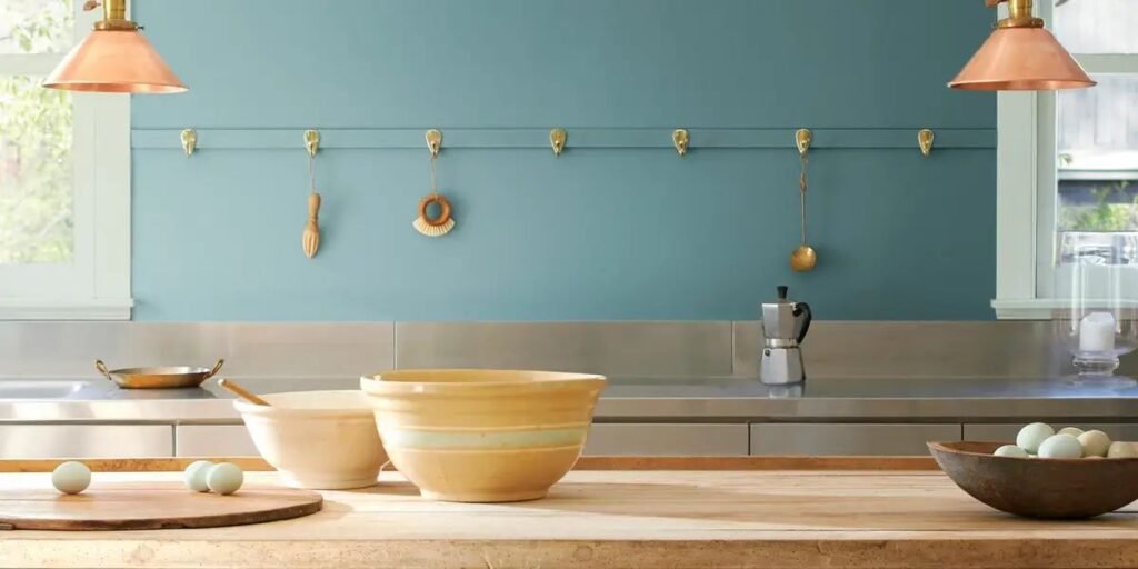
Blue-gray sits in that narrow, magical band of the color wheel where a wall can look cool, soft, and remarkably settled all at once. Benjamin Moore, founded back in 1883, has built one of the deepest catalogs of these nuanced shades, spread primarily across its Historical Collection, with codes starting with HC, and the numbered Classic Color Collection.
The trick, as anyone holding a stack of swatches knows, is choosing the right one. Two paints that both get labeled blue-gray can behave entirely differently once they hit a real wall. One reads almost neutral at noon and drifts slightly green by evening. Another looks distinctly blue next to crisp white trim, only to turn into heavy slate in a north-facing room.
This guide covers 12 genuine Benjamin Moore blue-gray colors, ranging from pale, whisper-light neutrals to deep, dramatic statement shades. Below, you will find how each paint actually behaves in real space, what it pairs best with, and where it tends to succeed or struggle.
Why Blue-Gray Paint Is So Popular
A pure blue wall carries a massive amount of color. In a bedroom or a tight hallway, that intensity can quickly feel overwhelming. A standard gray, on the other hand, faces the opposite problem, since a flat, undertone-free gray often looks cold and lifeless the moment the natural light drops.
Blue-gray bridges that gap beautifully. The blue injects temperature, personality, and depth, while the gray keeps the color restrained enough to sit gracefully alongside natural wood, stone, and trim without competing for attention.
It helps to understand that blue-gray is not a single, monolithic category. These paints generally split into four distinct sub-families:
- Blue-dominant shades where blue clearly leads and gray simply softens the edges.
- Near-neutral shades where the blue undertone appears primarily in ambient shadows.
- Green-pull shades that drift toward sage or seafoam under warm light.
- Violet-pull shades that maintain a clean, icy composure.
Benjamin Moore’s numbered color codes also offer a helpful built-in shortcut. The digits following the hyphen indicate depth within a color family, where lower numbers indicate darker, weightier paints. That is precisely why Smoke 2122-40 and Oxford Gray 2128-40 feel far more substantial on the wall than a pale tint like Silver Gray 2131-60.
The 12 Essential Benjamin Moore Blue-Gray Shades
Digital screens are notoriously unreliable for color accuracy, and even printed paper swatches shift dramatically under different light bulbs. Before buying full gallons, order sample pots, paint a large board of roughly two by two feet, and move it around your space. Observe it in morning light, at midday, and under warm artificial lamps at night.
Additionally, pay attention to the Light Reflectance Value published on Benjamin Moore’s site. Scaled from 0 for absolute black to 100 for pure white, the LRV is the single most objective metric for comparing how light or dark a room will actually feel.
1. Benjamin Moore Smoke (2122-40)
Smoke is the ideal choice if you want your blue-gray color to be genuinely noticed. Sitting right in the middle of the lightness spectrum, it carries enough pigmentation to read as a distinct hue rather than a muted gray, yet it never turns overly sweet or bright.
The undertone feels closer to a stormy ocean slate than a sky blue. In a space blessed with strong southern light, it opens up to show off its blue side. In a darker or north-facing room, it tightens into a deeper, moodier gray-blue.
A crisp, cool white trim like Chantilly Lace will highlight the blue undertones, while a creamier white will pull Smoke toward its gray side by contrast. Oak and walnut floors highlight its cool elegance, and brass hardware offers a stunning, high-contrast warm glow. It works wonderfully in living rooms, dens, and main bedrooms with reasonable daylight, though you should use caution in windowless spaces where it can feel heavier than anticipated.
2. Benjamin Moore Boothbay Gray (HC-165)
Boothbay Gray is a quieter, remarkably grounded option. Leaning gray first and blue second, it serves as a foolproof pick if you worry that a stronger blue might date quickly or clash with your current furniture palette.
With an LRV sitting in the mid-30s, it delivers real visual weight without feeling dark. Under warm incandescent lighting, it can occasionally reveal a subtle green-gray quality, which is a trait many designers love, though it can surprise homeowners expecting a pure cool tone.
Because it is so wonderfully restrained, it pairs seamlessly with beige sofas, jute rugs, and natural wood finishes, while off-white trim rests gently against it with minimal harsh contrast. It is an excellent choice for open-concept floor plans where one wall color needs to transition seamlessly across multiple lighting zones.
3. Benjamin Moore Silver Gray (2131-60)
Silver Gray sits on the pale end of the spectrum, and the -60 suffix tells the story. It is light and airy enough to function as an ethereal, cool wash of color on the wall rather than a heavy statement.
In sun-drenched rooms, the blue reads crisp and almost icy. In dimmer, softer light, it relaxes into an agreeable, pale gray. That flexibility makes it a perpetual favorite for smaller spaces where deeper shades might feel suffocating.
White tile, chrome fixtures, and glass emphasize its crisp, refreshing nature, while warm wood vanities and cream textiles work wonderfully to balance the chill. One important caveat is that pale blue-grays can look considerably bluer across a massive wall than they appear on a tiny swatch, so you should always test this shade on your largest wall before committing to bedrooms or bathrooms.
4. Benjamin Moore Wickham Gray (HC-171)
Wickham Gray is a light, muted classic tailored for anyone wanting just a whisper of color without straying out of the neutral family. Here, the blue plays a supporting role, resting quietly behind the dominant gray base.
Unlike bolder options, Wickham Gray never shouts blue. Instead, it acts as a sophisticated soft gray with a cool, refreshing edge. A slightly warm white trim prevents the room from feeling stark, while linen upholstery, light oak, and matte black fixtures all pop beautifully against it. It works exceptionally well in hallways, home offices, and rooms with patterned furniture where you need the walls to gracefully stay in the background.
5. Benjamin Moore Santorini Blue (1634)
With Santorini Blue, the palette takes a clear step toward vibrant color. It is a noticeably clearer, more saturated blue that looks far livelier on the wall than muted options like Boothbay or Wickham Gray.
Because of that added saturation, it benefits from natural visual counterweights. Neutral furniture, off-white trim, and woven textures like rattan or washed linen keep it perfectly anchored. Warm wood tones work exceptionally well here, as orange-toned woods sit opposite blue on the color wheel, creating a rich, harmonious balance. It is suited for sunrooms, bright kitchens, or guest bedrooms where a cheery atmosphere is desired, though you must sample it first in north-facing rooms to check its depth.
6. Benjamin Moore Wedgewood Gray (HC-146)
As part of the famed Historical Collection, Wedgewood Gray carries a dusty, historic patina that looks stunning in traditional homes and rooms featuring detailed architectural millwork.
It is a well-balanced mid-tone, deeper than pale tints yet softer than dramatic darks, making it a natural fit for classic and transitional interiors. Crown molding, wainscoting, and paneled doors look exceptional when painted in a bright white contrast against this shade, while rich walnut, leather, and unlacquered brass complement its heritage. It remains a dependable choice for formal dining rooms and traditional living spaces.
7. Benjamin Moore November Skies (2128-50)
November Skies is a gentle, mid-to-light blue-gray with a delicate cool cast. It caters to homeowners who want a tranquil, cool-toned backdrop without committing to the depth of a mid-tone shade.
It shares the same 2128 color family as Oxford Gray, meaning their undertones match perfectly so you can safely pair them across open spaces or use November Skies on main walls. In bright daylight, the blue undertones shine through, while in shaded rooms it settles into a comforting gray, working seamlessly in living areas, kitchens, and naturally lit bedrooms.
8. Benjamin Moore Silver Mist (1619)
Silver Mist resides at the lighter end of the spectrum and excels at looking almost neutral. Where Silver Gray leans distinctly icy, Silver Mist reads as a soft, luminous gray that only reveals its blue tint when placed alongside pure white trim.
While a deep paint color commands attention as a central feature of a room, a soft shade like Silver Mist acts as an elegant backdrop, allowing art, wood furniture, and textiles to take center stage. It pairs nicely with warm woods, soft ivory, and low-contrast furnishings. Just verify your undertones carefully since a strong yellow or pink cast in your flooring can make the cool tint clash. It works reliably for ceilings, master bedrooms, and main living spaces.
9. Benjamin Moore Oxford Gray (2128-40)
Oxford Gray steps up the drama. Carrying a -40 suffix, it possesses significantly more visual presence than paler tints and offers a wonderful solution when lighter grays feel too weak.
Because of its richness, it excels in focused applications such as accent walls behind a bed or sofa, kitchen islands, home offices, and custom built-in shelving. In north-facing light, Oxford Gray cools down into a moody slate, while in warm southern exposure it softens to show more gray. If you paint all four walls in a smaller space, ensure you balance it with lighter furnishings and adequate lamp lighting.
10. Benjamin Moore Philipsburg Blue (HC-159)
Philipsburg Blue is a substantial, commanding shade. It is the first color on this list that most people would unhesitatingly call a true blue, though its gray base adds incredible maturity and prevents it from ever looking harsh.
It possesses a crisp, tailored character that sets it apart from gray-first paints. Crisp white trim creates sharp architectural contrast against it, while aged wood, brass, and cream upholstery add crucial warmth. Good candidates include formal living rooms, elegant dining spaces, and bold entry halls, but plan your lighting carefully, since it reads quite dark in spaces without window light.
11. Benjamin Moore Van Courtland Blue (HC-145)
Another standout from the Historical Collection, Van Courtland Blue offers a softer, somewhat grayer alternative to Philipsburg Blue. It reads as an aristocratic, slate-leaning blue that anchors traditional spaces with ease.
Its greatest strength is its versatile stability: it retains its rich color identity across changing light conditions without turning harsh, harmonizing smoothly with warm white trim, greige upholstery, natural oak or walnut wood finishes, and antique brass hardware. It suits studies, formal bedrooms, and fully paneled rooms where the paint can envelop the space.
12. Benjamin Moore Hale Navy (HC-154)
Hale Navy brings our roundup to a close as a deep, dramatic dark navy rather than a traditional mid-tone blue-gray. With a very low LRV around 6, it sits near the dark end of the scale and can look close to black in low-light conditions.
However, it earns a deserving spot here as the ultimate anchor shade for readers who find lighter options too pale, supplying the striking contrast that soft colors cannot match. It shines brilliantly on targeted surfaces like kitchen cabinetry, built-in bookcases, front doors, and cozy dens. Pair it with bright white trim, brass or nickel hardware, and light marble counters for timeless contrast. If your project requires staying strictly within classic mid-tone blue-gray territory, swap this choice for Smoke’s darker family members in the 2122 sequence.
Related Article: 12 Best Sherwin-Williams Greige Paint Colors for Your Home