
Interior design rarely moves in leaps. It edges forward, one habit at a time, until a technique that used to sit on the fringe of professional practice suddenly becomes the thing every client is asking for. That is exactly what has happened with color drenching over the past three or four years. It is no longer a niche editorial trend, it is a request I hear in nearly every consultation where a client wants a room to feel finished rather than just painted.
The old formula is one most of us grew up with: a wall color, white trim, white ceiling. It is the paint scheme that built entire industries around trim tape and cut-in brushes. It works, but it also does something most homeowners do not consciously register. It chops a room into pieces. Wall. Baseboard. Ceiling. Three separate zones, three separate decisions, three hard lines your eye has to cross every time it moves around the space.
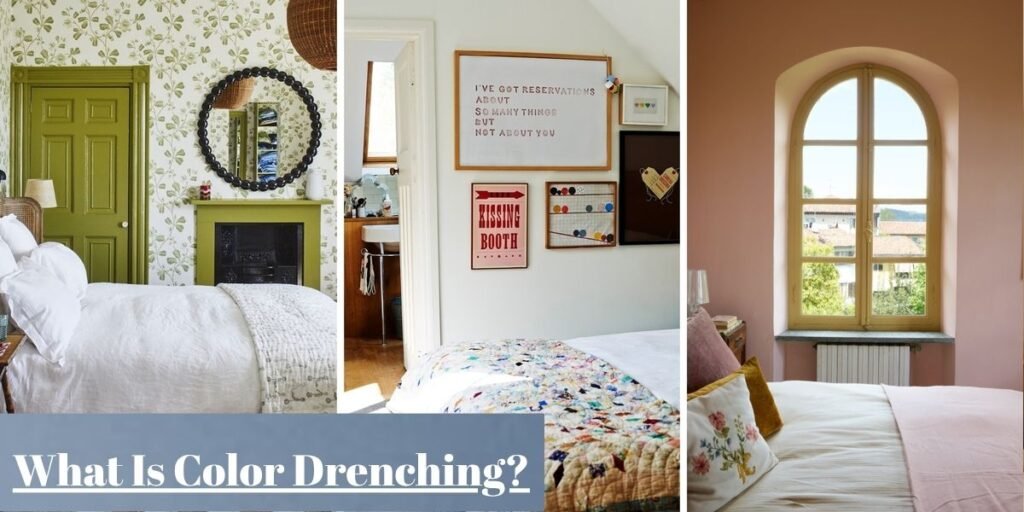
Color drenching throws that formula out. Instead of stopping at the drywall edge, the same paint moves across walls, trim, doors, ceiling, and built-ins. What changes is not just the palette. It is the geometry of the room itself: how light travels across it, where the eye lands, and how big or small the space feels once the boundaries between surfaces disappear.
Why Color Drenching Feels So Different From Traditional Paint Schemes
Contrast is a signal. Every time a dark wall meets a bright white ceiling line, your brain reads that junction as information. This is where the wall ends, this is where the room height limit sits, this is a corner. Traditional two or three tone schemes are full of these signals, which is part of why a small room painted in high contrast can feel busier and more boxed in than the square footage actually warrants.
Strip the contrast away and those signals go quiet. When trim, wall, and ceiling all read as one continuous surface, there is nothing for the eye to snag on. Shadow no longer falls in a hard line where wall meets crown molding. It graduates the way light behaves on a single sculpted form rather than a series of flat planes stitched together.
That is the mechanism behind the cocooning effect designers talk about with drenched rooms. It is not a trick of color psychology so much as a genuinely different optical experience, and it is the reason a drenched powder room can feel more like a considered architectural moment than a painted box.
What Gets Painted in a Color-Drenched Room?
A common misconception is that color drenching means four walls and maybe the ceiling. It does not. The whole point of the technique is continuity, and continuity breaks the moment you leave an element out.
A properly drenched room typically carries the color across the walls and ceiling, including any sloped attic planes or tray details that would otherwise interrupt the plane. It includes every piece of trim:
- Baseboards and crown molding
- Picture rails and chair rails
- Door faces and their surrounding casings
- Built-in joinery, like reading nooks, bookcases, or old radiator covers
- Wooden fireplace mantels
Fireplace surrounds are often the trickiest call. A painted wooden mantel disappears beautifully into a drenched scheme, while an original brick or stone hearth is usually better left alone.
The underlying discipline is not a checklist so much as a simple question. Does this element compete with the wall plane, or can it recede into it? Anything that can recede, should.
Choosing a Color That Works With the Room
Picking a drenching color is a different exercise from picking an accent wall shade. You are committing an entire room worth of surface area to one decision, and that decision has to hold up under every kind of light the room will ever see.
Natural Light Changes Everything
Orientation matters more here than in almost any other paint decision you will make.
A north-facing room receives flat, cool, blue-cast daylight for most of the day. Pale cool greys and icy blues tend to read as flat or even a little cold in that light. Warm terracottas, ochres, and deep forest greens compensate for that missing warmth and tend to look richer, not duller, as the light fades.
South-facing rooms get the opposite problem with hours of strong, warm sun. They can carry highly saturated jewel tones like sapphire, emerald, or aubergine without those colors ever looking murky. They can also support a cooler palette like dusty navy or sage as a deliberate counterweight to all that warmth.
East and west facing rooms are moving targets. An east-facing bedroom is flooded with warm light in the morning and goes cool and shadowy by late afternoon. A color with some inherent warmth in its undertone keeps the room from feeling flat once the sun moves round. West-facing rooms do the reverse. Dim in the morning, warm and golden by evening.
Light Shades or Deep Colors?
Deep, saturated colors such as charcoal, ink navy, bottle green, and oxblood are what most people picture when they hear color drenching, and for good reason. Dark pigment absorbs light rather than bouncing it back, which is exactly what blurs a room boundaries and gives it that enveloping, after-dark quality. These colors are particularly effective in rooms used mainly in the evening, such as dining rooms, snugs, and primary bedrooms.
Pale and mid-tone palettes drench just as effectively, and for daytime rooms they are often the better call. A soft sage, a warm putty, or a dusty rose carried across every surface still removes the trim-line contrast that makes a room feel sliced up. It just does it while keeping the space feeling airy rather than intimate.
The decision is not dark, it is dramatic and light is safe. It is about which mood the room is actually used for.
Look Beyond the Paint Swatch
A 2-inch paper chip under a shop fluorescent lighting will lie to you almost every time. Buy the largest sample size your paint brand offers and move it around the room across a full day. Look at it at 8:00 AM, at midday, and again after the lamps go on at night. A color that looks perfectly balanced at noon can shift noticeably warmer or cooler once artificial light takes over.
Pay just as much attention to the fixed elements you are not painting. Honey-toned oak flooring, a grey slate hearth, brass hardware, or existing quartz countertops all carry their own undertones. They will pull your paint color in a direction the swatch never showed you.
A green with a slightly yellow bias can suddenly read as genuinely yellow next to cool grey stone. A true navy can look purple against warm wood tones. This is the step most first-time renovators skip, and it is the one that causes the most repainting.
Where Color Drenching Has the Greatest Impact
Not every room benefits equally, and part of doing this well is knowing where the technique earns its keep.
A color drenching living room responds particularly well because a single-color envelope gives art, upholstery, and architectural features a unified backdrop to sit against. Trim contrast stops competing for attention with the things you actually want people to notice.
A color drenching bedroom is arguably where the psychological effect is strongest. A room wrapped in slate blue, muted olive, or warm taupe has almost nothing left to visually process, which is precisely what a space built for rest should feel like.
Smaller enclosed rooms such as powder rooms, home offices, and formal dining rooms are where drenching tends to look the most deliberate. A confined footprint can absorb a genuinely saturated color without becoming overwhelming, producing what is often described as a jewel box effect. Small, dark, and unexpectedly luxurious rather than cramped.
Where it gets genuinely difficult is large, open-plan spaces with double-height ceilings and few natural breaks. Without a doorway, a change in ceiling height, or some other architectural cue to tell you where the color should logically stop, drenching an open-concept great room can either look intentional and cohesive or simply unfinished. The margin between those two outcomes is thinner than most people expect.
Bringing Texture Into a Color-Drenched Room
The one legitimate criticism of color drenching is that a room in a single flat hue can go dead if nothing else is doing visual work. Texture is what keeps it alive, and the strongest drenched interiors lean on material contrast precisely because the color contrast has been removed.
- Raw or oiled wood grain: A walnut coffee table, an oak sideboard, or exposed ceiling beams read as their own kind of texture against a flat painted plane.
- Unrefined linen: Works on drapery or cushions to bring softness and weave rather than grain.
- Honed travertine or rough-cut slate: Placed on a hearth or tabletop, these introduce a cool, matte counterpoint that a painted wall simply cannot offer.
- Velvet upholstery: Earns its keep here because its pile catches and scatters light differently depending on the viewing angle, creating tonal variation within the exact same color family.
- Woven jute, rattan, and cane: Bring structural warmth and a hand-made quality that flat paint cannot replicate.
- Thick wool or high-pile rugs: A tonal variation of the wall color grounds the whole scheme without breaking it.
Sheen does quieter but equally important work. A flat or matte finish on the ceiling hides imperfections and avoids glare from overhead light. An eggshell or low-sheen finish on the main wall plane gives a bit of depth while staying wipeable. A satin or semi-gloss on trim, doors, and cabinetry stands up to daily handling and bounces just enough light to register as a distinct surface, even in the identical color code. Varying sheen while holding the color constant is one of the details that separates a professionally executed drenched room from a DIY attempt that reads as flat.
Layered warm lighting like brushed brass sconces, table lamps with linen shades, and picture lights over art matters more in a drenched room than in almost any other scheme. A single flat overhead source will expose exactly how uniform the surfaces are. Good lighting design breaks that uniformity back up in a controlled way.
Unlacquered brass, aged bronze, or polished nickel fixtures give the eye a metallic counterpoint against the matte color field. Swapping hardware costs a fraction of what repainting does and is often the single easiest upgrade in an existing drenched room.
Before You Paint Every Surface the Same Color
Color drenching solves specific problems. It is not a universal upgrade, and there are two situations where I actively steer clients away from it.
The first is a room with genuinely poor natural light that relies almost entirely on overhead fixtures. Drenching amplifies whatever light quality already exists in a room. In a bright room that is a gift, but in a windowless or north-facing basement space with weak artificial lighting, a cool or dark drench can tip from cozy into genuinely cavernous. In that scenario, a lighter, warmer palette or simply not drenching at all is usually the better outcome.
The second is architecture that was built to be seen in contrast. A hand-carved mahogany mantel, an original stained-glass casement, or a run of Victorian picture rail with real detailing were designed as focal points. Painting them the same flat color as the surrounding wall erases decades or centuries of craftsmanship rather than showcasing it.
In period properties especially, the better move is often to drench everything around a historic feature and deliberately leave the feature itself untouched, letting the surrounding continuity make it stand out more, not less.
How Designers Handle Trim, Doors, and Architectural Details
Getting the finish right is arguably more technical than getting the color right because different surfaces in the same room take wear differently and reflect light differently, even when the pigment is identical.
| Surface Area | Recommended Paint Finish | Functional Benefit |
| Ceilings | Flat / Matte | Hides minor surface imperfections and prevents unwanted glare |
| Drywall / Plaster (walls) | Eggshell / Low-Sheen | Delivers smooth depth while remaining wipe-down friendly |
| Trim & Baseboards | Satin / Semi-Gloss | Resists scuffs, cleans easily, and subtly bounces ambient light |
| Doors & Cabinetry | Semi-Gloss / Satin | Stands up to frequent handling and daily wear |
Keeping the exact color code across every row of that table while stepping the sheen up as surfaces get more hands-on contact is the professional standard. It is the detail most DIY color-drenching attempts miss, which is why some finished rooms look intentional and others look like a paint job that simply ran out of steam at the trim line.
How to Make Color Drenching Work With Your Existing Décor
You do not need to gut a room to drench it. Start by reading the undertones already in the space. The flooring and the largest furniture pieces will tell you more than any color wheel.
Warm honey-toned hardwood and leather seating pair naturally with wall colors carrying their own warmth, like creamy beige, rust, or olive. Cooler grey ash flooring or slate tile calls for the opposite, such as slate blue, spruce, or dovetail grey. Fighting the undertone of a floor you are not repainting is a losing battle.
Once the base color is chosen, small doses of a complementary accent keep a monochromatic room from tipping into monotony. A mustard cushion, a burnt-orange ceramic, or an art piece with a contrasting frame works exceptionally well. The rule of thumb most designers work to is roughly one or two accent notes per room. More than that starts to compete with the very continuity you painted the room to achieve.
Is Color Drenching Right for Every Home?
It adapts to more architectural styles than you would expect, though the reasoning behind why it works shifts from style to style.
- Traditional interiors: A single continuous color modernizes heavy, ornate millwork without stripping away the detailing itself. The molding profile stays while the visual weight lightens.
- Contemporary homes: Drenching reinforces the clean-lined, minimalist aesthetic that is already the point of the architecture.
- Apartments and smaller footprints: Removing trim contrast is one of the most reliable ways to make a compact room read as larger and less chopped up because there is less visual clutter for the eye to catalog.
- Period properties: Rich historical hues like deep ochre, bottle green, and classical slate read as authentic to the era rather than trend-driven, provided original architectural features are handled with restraint.
- Minimalist spaces: A saturated drench adds warmth and depth that pure white walls often lack, without introducing new objects into the room.
- Busy family homes: The technique stays entirely practical as long as the lower half of the room, including trim, doors, and high-touch walls, is finished in a durable satin or semi-gloss that can be wiped down easily.
The honest test is not architectural style at all. It is how the room is actually lived in day to day, and whether that use case wants intimacy, calm, or drama. That is what the color and depth you choose will ultimately deliver.
Frequently Asked Questions
Does color drenching make a room look smaller?
No, if anything, the opposite occurs. Removing the contrast lines between wall, trim, and ceiling makes corners visually recede rather than announce themselves. This tends to make a room feel larger and less fragmented, even in a dark colorway.
Do ceilings have to match the walls?
Matching gives you the strongest, most seamless result. That said, a ceiling shade one or two tones lighter than the walls still reads as continuous while lifting a low ceiling slightly. That is a useful compromise in older homes with tighter ceiling heights.
Can white be used for color drenching?
Yes. A warm white carried across walls, trim, doors, and ceiling produces a clean, gallery-like calm without any of the harsh contrast of a standard white-wall and white-trim scheme. The continuity still does its job even at the palest end of the spectrum.
Is color drenching suitable for rental homes?
It is a harder sell there. Because it involves repainting trim and doors as well as walls, you are signing up for a full repaint, likely back to a neutral, before you move out. It suits homes where you are planning to stay long enough to justify that labor.
Should trim always be painted the same color as the walls?
For the technique to actually deliver its effect, yes. The moment trim goes a different color, you have recreated the contrast-driven scheme drenching was designed to move away from.
Which paint finish works best for this style?
There is no single answer. The best results mix finishes deliberately. Flat or matte on the ceiling, eggshell on the main walls, and satin or semi-gloss on trim and doors, all in the exact same color code.
Final Thoughts
Color drenching has outgrown its early reputation as a bold, editorial-only choice. What it actually offers is far more practical. A way to make a room’s architecture, light, and proportions work together instead of competing.
Choose a color that genuinely suits the way light moves through your specific room, commit to it across every fixed surface rather than half-measures, layer in enough texture to keep the scheme from going flat, and you end up with a space that feels resolved in a way a wall-plus-white-trim room rarely does.