
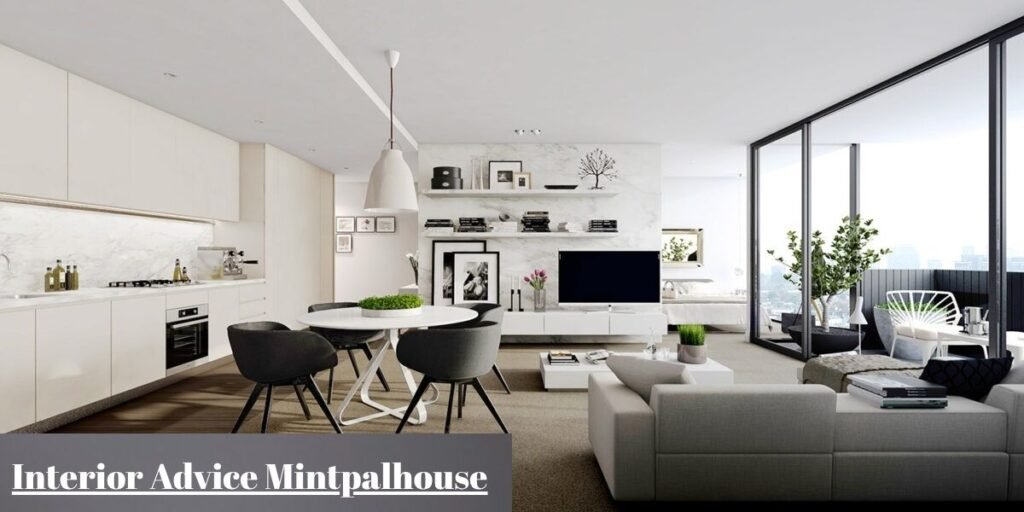
Most homeowners do not struggle with buying nice things. They select a velvet sofa they love, find a striking rug on sale, pick a trending wall color, and invest in solid brass lighting fixtures. Yet when they step back, the house feels like a collection of showroom setups rather than a single, fluid home. The living room feels detached from the hallway, and the kitchen seems to belong to a completely different design era.
A truly cohesive interior does not mean painting every wall the same shade or buying a matching furniture set. Cohesion depends on subtle relationships between colors, materials, proportions, and light as they move from one room into the next. This is the exact gap the interior advice on MintPalHouse tries to close, using mint undertones, grounded neutrals, natural textures, and intentional scale to build visual flow throughout a property. What follows takes that framework and grounds it in the same standards professional designers, paint manufacturers, and kitchen and bath specifiers actually use on paid projects, so you can apply it with confidence rather than guesswork.
What Is MintPalHouse?
MintPalHouse is an online platform covering home décor, interior architecture, DIY projects, architectural renovations, and garden design. Rather than pushing short-lived visual trends, its editorial content leans toward sustainable home styling, practical design solutions, and layouts that actually function for daily life.
The site’s interior design framework is particularly useful for anyone trying to bridge modern minimalism with warm, organic living. Its recurring themes rely on soft mint tones, balanced neutrals, and rich organic materials to build a design language that adapts across different floor plans, whether you’re working with a 900-square-foot condo or a five-bedroom colonial.
What makes mint worth this level of attention right now is timing. It sits inside the broader sage and eucalyptus movement that has quietly taken over the paint industry. Three of the five major Colors of the Year named across the leading paint brands in 2026 fall in the green family, a pattern that started building back in 2022 when Sherwin-Williams named Evergreen Fog (SW 9130) its Color of the Year and Benjamin Moore followed with October Mist. Mint and sage are not a passing Pinterest phase. They have become one of the closest things the design world has to a new neutral.
What Interior Advice Does MintPalHouse Give?
The central philosophy across MintPalHouse’s interior guides is intentional harmony rather than strict uniformity. Instead of treating every room as a blank canvas, the site’s writers focus on how a handful of design elements should travel smoothly from space to space, so a home reads as one story instead of ten disconnected chapters.
Their advice centers on treating soft mint as a foundational anchor rather than a wall-to-wall statement. They pair these cool green undertones with warm organic woods, matte metallic finishes, and grounded neutrals, then build depth through tactile fabrics, stone, and woven fibers instead of relying on paint color alone to do all the work. That last point is worth sitting with, because it’s exactly where most DIY projects go wrong: a fresh coat of paint gets all the attention while the floor, the lighting, and the furniture proportions get none.
Furniture choices are dictated by room dimensions first and aesthetics second, a discipline that keeps floor space genuinely open rather than just photographing well. Layered lighting setups adjust how paint colors and natural textures read throughout the day, since a mint wall at 8am under north light looks nothing like the same wall at 6pm under a warm lamp. Finishing touches such as artwork, mirrors, and greenery act as structural focal points rather than an afterthought pile of clutter.
Start With a Color Palette
Building a cohesive home around mint requires real color discipline. Mint can easily look washed out, overly cold, or clinical if it’s applied without support. To avoid that, mint should sit alongside a carefully curated set of companion tones that add warmth and structural weight.
Soft whites, warm alabaster, and creamy taupe work as the primary base, keeping rooms open and bright. Muted mint or sage then becomes the anchor tone, applied deliberately on a focal wall, built-in cabinetry, or a major upholstery piece rather than everywhere at once. For structural contrast, grounded neutrals like charcoal, deep slate, or muted mocha come into play, while natural oak, warm walnut, and pale terracotta undertones bring in the warmth that balances mint’s cool cast. Restrained brass, blackened steel, or soft blush pink round things out as accent touches used sparingly.
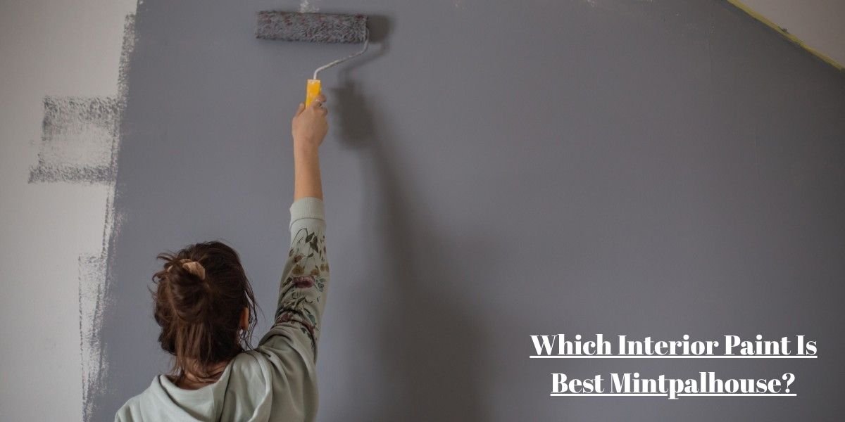
If you want a starting point that’s already been vetted by professionals, look at what’s currently topping designer shortlists. Sherwin-Williams Evergreen Fog carries a Light Reflectance Value (LRV) of 30, meaning it reads true to color in most lighting rather than washing out in direct sun or going murky in shade, according to a 2026 paint color roundup from Facade Colorizer. For a warmer, more olive take, Benjamin Moore’s Saybrook Sage (HC-114) is the go-to on traditional and colonial-style homes. If your budget or supplier leans toward Valspar, their 2026 Color of the Year, Warm Eucalyptus, delivers similar performance at a lower price point. LRV matters more than most homeowners realize: a low-LRV mint (in the teens) will read almost like a smoky jade in shade, while a higher-LRV mint (30 and above) stays legible and fresh even in a north-facing room.
These supporting colors should not appear in identical ratios in every room. A living room might feature warm white walls with a slate grey sofa and mint accent pillows, while the adjacent kitchen flips the ratio with mint cabinetry and white stone counters. The shared palette keeps the spaces connected without repeating the same look twice, which is the entire difference between a coordinated home and a matching one.
Bring in Wood and Natural Materials
Relying on color alone to create contrast almost always makes a room look flat. Natural materials bring physical depth, tactile variety, and warmth that a cool pastel simply cannot supply on its own.
Wood is the primary grounding element when you’re working with mint. Pale oak, ash, and light birch soften mint’s cool undertone and keep a space feeling airy. Darker woods such as oiled walnut or rich teak add visual weight and push a room toward something more formal. Either direction works, but mixing more than two wood tones in one sightline is where most rooms start to look accidental rather than intentional.
Textural variety should be layered across different heights and surfaces. Underfoot, a woven jute rug, brushed limestone tile, or broad-plank hardwood lays the foundation. At eye level, slatted wood wall panels, honed marble counters, and linen drapery catch and diffuse light throughout the day. Closer to hand, a heavy wool throw, boucle cushions, and raw ceramic pottery finish the room off. Combining these elements gives a home an organic, layered character. The natural grain in wood and the subtle variation in raw stone are exactly what keep a smooth, painted surface from feeling sterile, the same reason high-end hospitality interiors almost never rely on paint alone to carry a room.
Get the Furniture Scale Right
A common mistake is choosing furniture based purely on how it looks in isolation rather than how it fits the room. A deep, oversized sectional might look inviting on a showroom floor, but it will overwhelm a modest living room, block traffic flow, and visually shrink the space the moment it’s delivered.
Proportion comes down to balancing solid furniture against open floor space. Larger rooms need substantial pieces (thick-legged timber tables, heavily upholstered sofas) to avoid feeling empty, while smaller rooms benefit from exposed legs, glass tops, or low-profile backs that let light travel through uninterrupted.
Clearances are not a matter of taste. They’re what keep a floor plan functional day to day, and the industry numbers are more specific than most décor blogs let on. According to the National Kitchen and Bath Association’s published planning guidelines, a general walkway should measure at least 36 inches wide, while a kitchen work aisle needs at least 42 inches for a single cook and 48 inches when two people are working at once. Seating clearance follows a similar logic: allow 32 inches from a table edge to the nearest wall when no traffic passes behind a seated diner, but bump that to 36 inches if people need to walk past, or 44 inches if they need to walk fully behind the chair. In a living room, the same principle applies at a smaller scale. Keep coffee tables 14 to 18 inches from the sofa for comfortable legroom, and make sure any primary hallway or walking route holds to that same 3-foot minimum. These aren’t arbitrary suggestions. They’re the numbers certified kitchen and bath designers use on real construction drawings, and they translate directly to any room in the house.
Selecting pieces that respect the room’s actual dimensions, not just its square footage on paper, is what keeps a home open and easy to move through rather than a maze of furniture you have to navigate around.
Let Lighting Shape the Room
Lighting changes how colors, finishes, and room dimensions are perceived throughout the day, and mint is particularly sensitive to this. Cold northern light can make it feel icy and clinical, while warm southern sun brings out its softer, more botanical undertone.
A balanced lighting scheme never relies on a single overhead fixture. Layer natural light through sheer window treatments, add ambient light from warm recessed ceiling fixtures, bring in targeted task lighting from reading lamps or under-cabinet LEDs, and finish with accent lighting from directional sconces that highlight artwork or a textured wall.
Bulb color temperature, measured in Kelvin, has an outsized effect on how a mint or sage wall actually reads. Per lighting-industry references, including the U.S. Department of Energy’s guidance on LED lighting, residential bulbs typically range from about 2200K to 6500K, and lower numbers mean warmer, more amber light while higher numbers mean cooler, blue-white light. Bulbs in the 2700K to 3000K range emit a soft, golden glow that counteracts mint’s cool cast and is what most designers reach for in living rooms, bedrooms, and dining rooms. 2700K specifically flatters skin tones and pairs beautifully with brass, wood, and other warm materials, which is exactly the material palette this whole approach depends on. 3000K is slightly crisper and works well in kitchens and bathrooms where you still want clarity without losing warmth. Bulbs rated above 4000K should generally be avoided in living areas, since they wash out muted neutrals and cast harsher shadows, an effect that becomes especially obvious against a soft green wall. For colors, true, natural-looking whites and skin tones, look for a Color Rendering Index (CRI) of 90 or higher rather than judging a bulb on Kelvin alone. Always test paint swatches under both natural daylight and your actual indoor bulbs before committing, since the same sage can look entirely different at noon versus after sunset.
Give Each Room Its Own Version of the Palette
Creating flow through a house does not mean repeating the same room design over and over. Each space should express the shared color and material palette according to its own size, layout, and purpose.
The living room can carry the strongest color statement and the primary furniture pieces. Paint the walls a muted mint or introduce a wide mint-upholstered armchair as an anchor. Ground the room with a mid-toned hardwood floor, a substantial wool rug, and matte black lighting fixtures for contrast.
The kitchen carries the palette through fixed, architectural finishes rather than paint alone. Mint-painted lower cabinetry paired with warm white upper walls, honed quartz or marble counters, and warm brass hardware is a combination that shows up constantly in current kitchen renovations, and for good reason: it lets the color live somewhere permanent instead of somewhere you’ll want to change in two years. Exposed wood shelving adds organic warmth on top.
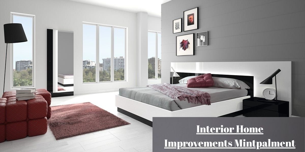
The bedroom shifts toward softer, more tactile interpretations. Keep the walls off-white or light taupe, then bring mint in through washed linen bedding, an upholstered headboard, or a muted area rug. Low-level, warm lighting (that same 2700K range) does most of the work here in terms of comfort.
The bathroom leans on tile, stone, and mirrors to carry the theme. Vertical mint subway tile inside a shower enclosure, paired with neutral floor tile, brushed nickel or black plumbing fixtures, and a natural light-wood vanity, keeps the room feeling calm rather than clinical, which is a real risk in a room full of hard, reflective surfaces.
This room-by-room flexibility is what makes a space feel distinctly tailored while staying visibly connected to the rest of the home, rather than looking like every room came from a different renovation budget.
Add Contrast Through Small Details
Without contrast, a muted, light-toned palette can feel incomplete no matter how well the base colors are chosen. Small, darker elements create sharp focal points that frame a room and give the eye somewhere to land.
Contrast is easiest to build through everyday finishing touches. Swap plain cabinet handles for matte black, oil-rubbed bronze, or warm brushed brass. Use slim black picture frames, dark window casings, or a dark wooden mirror rim to outline key wall areas. Introduce pattern through striped linen cushions, a geometric woven throw, or a subtle floor runner to break up solid surfaces.
Plants do a surprising amount of the same work. A broad-leaf fiddle-leaf fig, a monstera, or an olive tree adds natural, deep-green contrast that anchors lighter tones in the room and softens hard edges around furniture and tile. None of these details need to be loud or expensive. Their entire job is to give the palette definition without introducing a competing color that breaks the calm, cohesive look you’ve built.
Interior Mistakes Worth Avoiding
Creating a connected home takes restraint, and most of the mistakes that undo a good palette are avoidable once you know to watch for them.
The most common one is replicating rooms identically: the same paint code, the same rug pattern, and the same furniture style repeated in every space until the house starts to feel like a hotel chain rather than a home. A close second is mixing clashing undertones, such as pairing a cool, blue-leaning mint with a yellow-based cream without a neutral in between to bridge them.
Buying oversized sectionals or dining tables that block the walkways covered above distorts a room’s proportion no matter how nice the individual piece is. Relying on a single bright, central ceiling fixture while skipping ambient lamps produces flat, unflattering light, which is especially unkind to a soft green wall. Adding decorative pieces before the major furniture and wall colors are settled almost always leads to a cluttered result, since you end up styling around gaps instead of filling in a finished plan. And painting a small, light-starved room in a cool pastel, mint included, often reads dull or grey rather than airy, which is exactly why the LRV and lighting guidance earlier in this piece matters more than the paint chip alone.
A Practical Way to Pull the Whole House Together
Rather than styling rooms completely at random, follow a logical process to ensure every decision builds on the last:
- Start with permanent features. Take note of unchangeable elements like existing hardwood floors, kitchen counter slabs, window positions, and structural brickwork.
- Establish the main palette. Pick your primary wall base, your mint accent shade, and two or three supporting neutrals.
- Select core recurring materials. Choose primary wood tones, hardware metals, and woven fabrics that will repeat across rooms.
- Distribute the scheme per room. Decide how each space will interpret the palette through wall paint, cabinetry, or soft furnishings.
- Set up lighting early. Install lighting setups and test bulb warmth before committing to final paint colors or upholstery fabrics.
- Finish with decor and artwork. Add wall prints, plants, rugs, and decorative accessories last to tie each space together.
This clear order keeps design choices focused, practical, and aligned with your overall vision.
Bottom Line
A cohesive, well-designed home relies on subtle relationships between spaces, not strict repetition. Drawing from the MintPalHouse design principles is not about buying a matching furniture bundle or painting every surface green. It’s about creating smooth, organic transitions from room to room using balanced color ratios, warm natural textures, tailored proportions, and layered lighting.
The details that make this approach reliable rather than trendy are the ones borrowed from outside the décor world entirely: an LRV of 30 that keeps a sage wall true to color, an NKBA clearance standard that keeps a floor plan walkable, and a 2700K to 3000K bulb that keeps a cool green from ever reading cold. When those elements work together, every room maintains its own purpose while still feeling like it belongs to the same house.